Procreate Color Palettes Made Easy
Create and manage Procreate color palettes, plus Freya's 5-step method for picking a palette from any photo, from middle tones to highlights.
One of the important fundamentals for any creative process is understanding how to choose colors using color theory. It may come harder to some than others, but there IS a workaround you can use in Procreate that can assist beginners and experienced artists alike! Procreate lets you experiment and create custom palettes or import pre-made ones. From bold and vibrant neon to subtle and cozy pastels, the choices are endless. In this blog, I will introduce you to the wonderful world of Procreate color palettes!
Why Color Palette Is Important
Color is one of the major factors in making a visually appealing art. Depending on which colors you use, you can evoke wildly different feelings from your audience! Want them feeling a sense of peace? Use light and cool colors! Want them to feel happy and positive? That’s where warm colors can help a bunch! Color and its psychology in art is an entirely different topic, but that just goes to show just how useful it can be.
Understanding the power of colors is a valuable skill that us artists need to study continuously, and while it may take some time to expertly navigate the color wheel, palettes are here to save the day. Trying out pre-made color combinations and seeing how the colors work and balance together is a fun way to learn and practice. Over time, you will get used to this and even make up your own palette!
To add to that, pre-made palettes (or a custom one of your own) with a specific colors of your choosing is a huge help. It takes away the time spent manually picking colors on the color wheel and allows you to focus more on the art itself, so you can be more productive and efficient. So, not only do these palettes save time and boost your creativity, but they also keep your colors consistent throughout your process.
Color Palettes in Procreate
Now that we understand how useful palettes are, let’s get to finding them in Procreate!
1. Opening the Color Palette
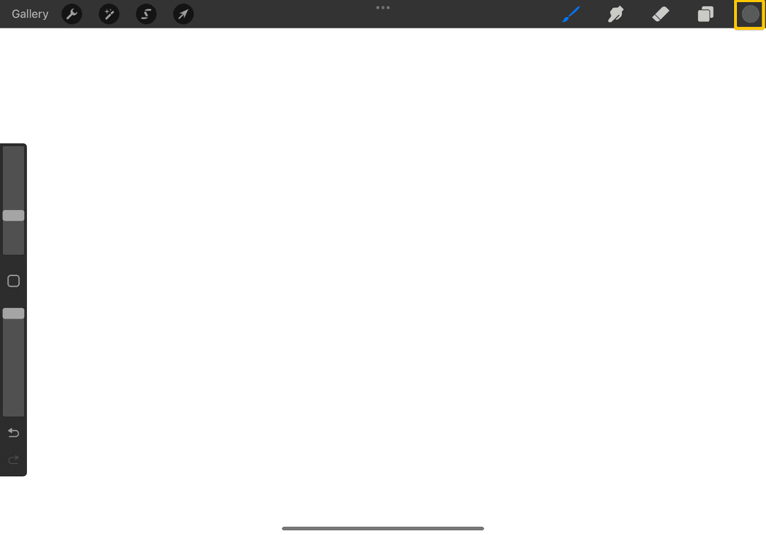
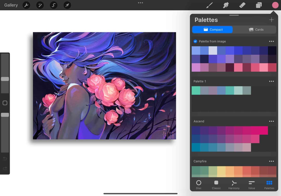
When you have your Procreate ready, go ahead and tap on the color icon in the top right corner to open up the Colors Panel.
2. Palettes
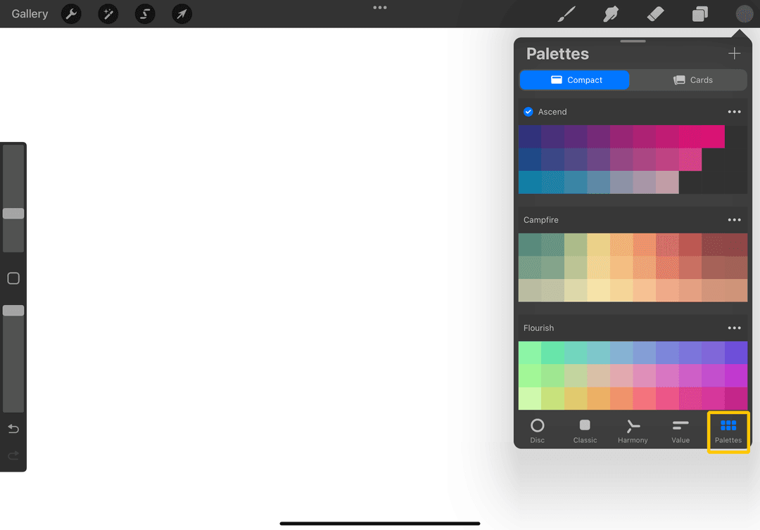
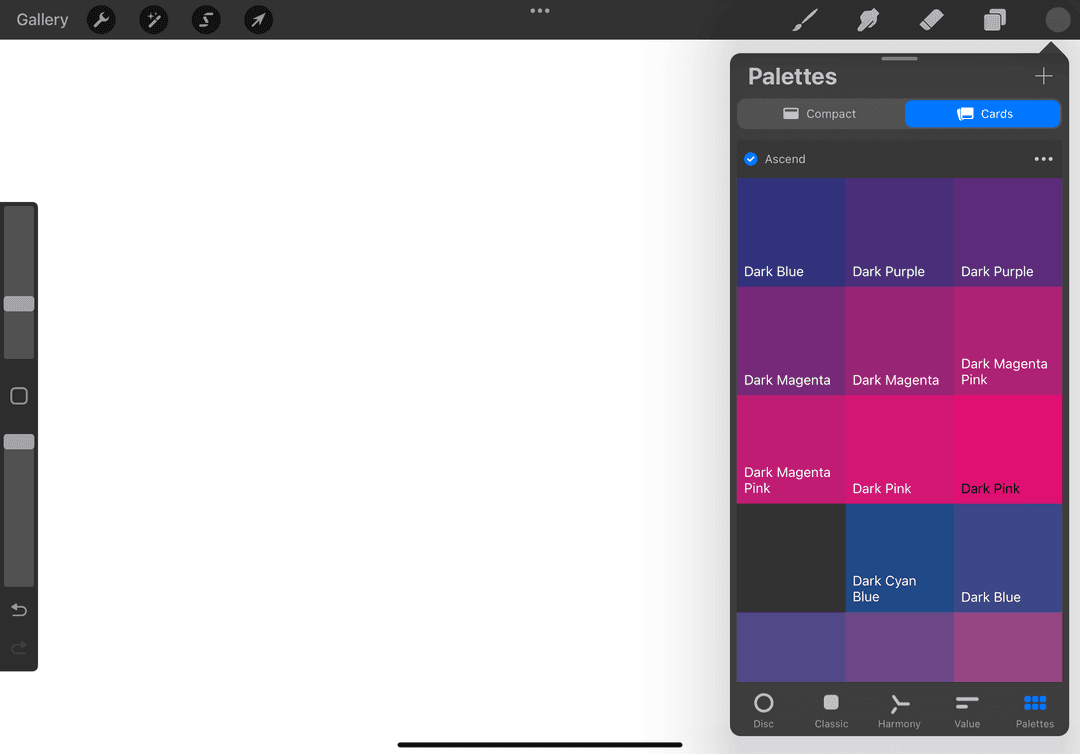
Tap on the “Palettes” option at the bottom of the panel. Voilà! You can decide to either see them as Compact lists or as Cards with name colors.
3. Menu
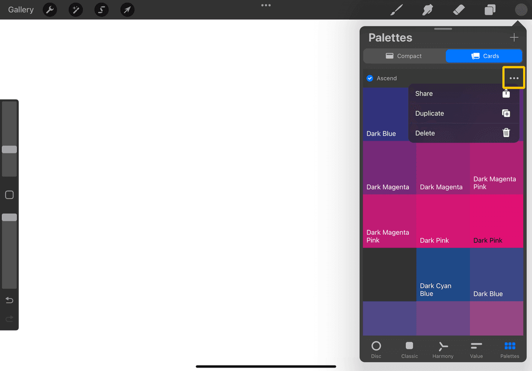
Tapping on the 3 dots shows options to Share, Duplicate, or Delete the chosen palette.
How to Add Palette in Procreate
Want to try to make your own combinations? Here’s a step by step on how to do that!
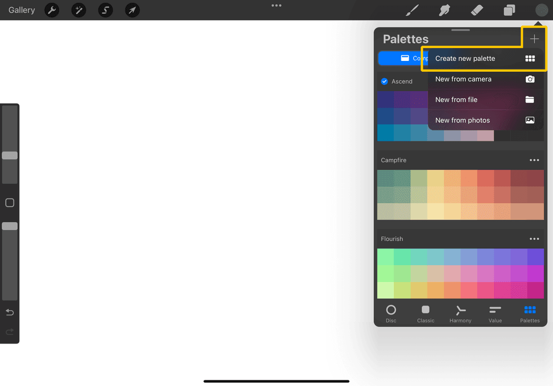
1. Open up your Palettes' panel once again and tap on the “+” icon in the upper right corner of the window. There are multiple options as well, and we will go over those in the next sections, but for now, choose “Create new palette” and let’s make our very own!
2. An empty palette will pop up and to name it, simply tap on the “Untitled” and you can change the title.
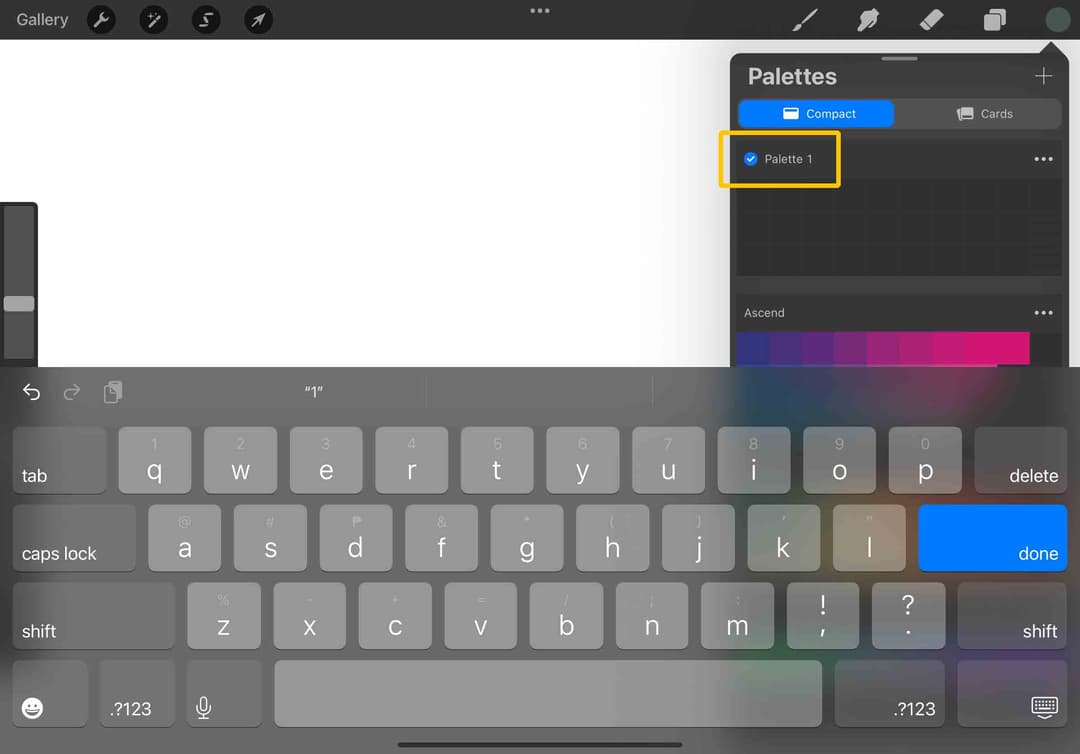
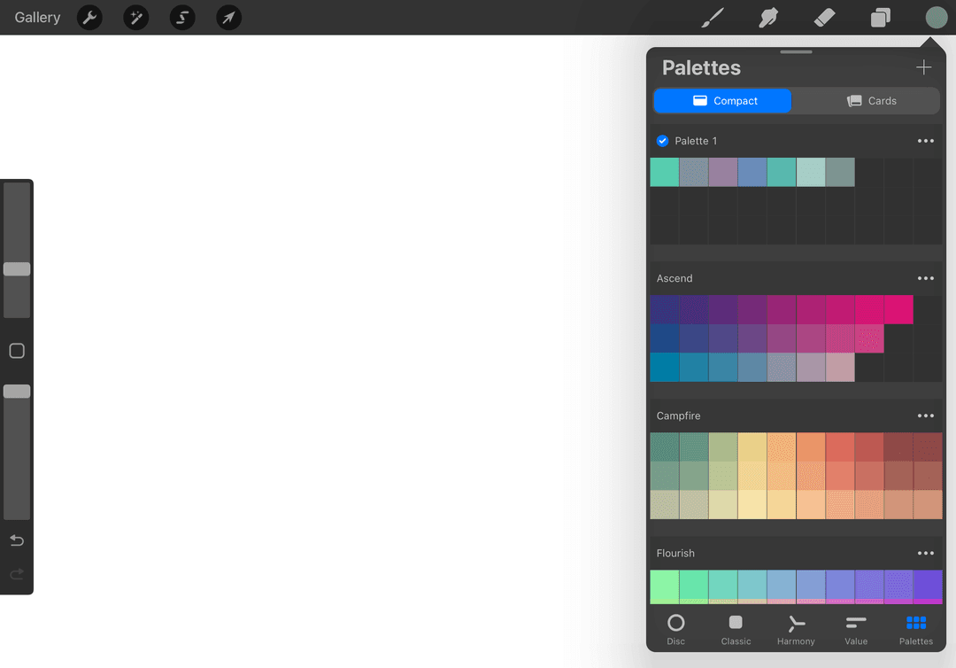
3. Adding colors is as simple as tapping on any of the empty slots in the palette. It will take the color you currently have and save it for you! You may change to the Classic color picker or any of the others to pick another color and come back to the Palettes to save it. Do this as much as you’d like to create your own palette!
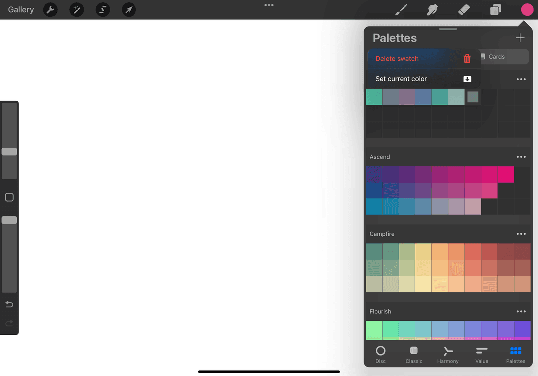
4. To delete a swatch, tap and hold on a color and press “Delete”. You can also change a swatch using this action by selecting “Set current color”.
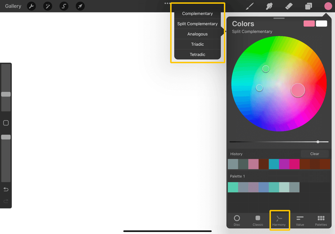
Tip: Use the Harmony panel to easily find colors that work well together!
Procreate Palettes from Image
Now that you’ve made your own palette from scratch, it’s time to circle back to the other options we discussed earlier. The awesome thing about Procreate palettes is that you can extract color palettes from images as well!
In the middle of a cool sunset and want to recreate it? Just choose “New from camera” to take a picture and get the colors then and there! Saved a cool photo from Pinterest? Just tap on the “+” and select “New from photos” and you’re all set. Choosing colors has never been this easy!
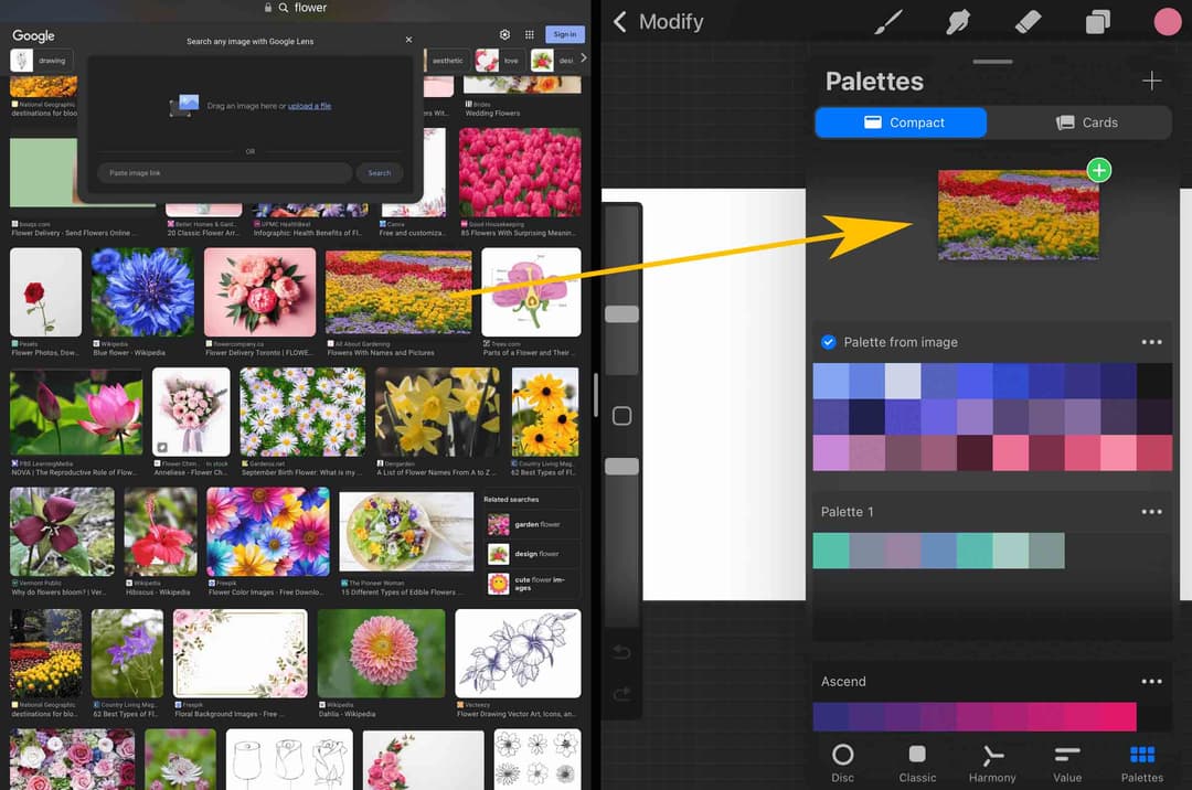
Here’s another cool trick that some of you might not be aware of. Did you know you can drag images from your browser directly to the Palettes panel and get those colors?
Just hold and drag an image from your browser (don’t let go!) and open up Procreate and Palettes panel. Drag the image to an empty space just at the space above a palette, and it should create a space where you can drop the image and ta-da! You got your colors! Doing it like this is a little tedious, so try to do a split screen to make things easier.
How Freya Picks Colors from a Photo (the Palette Exercise)
Auto-extracting a palette is fast, but the palettes Freya actually paints with are picked by hand. In the Procreate Masterclass she spends a whole lesson building palettes from photos (flowers, donuts, portraits, a sunset), and the method is the same every time.
Step 1: Start with the middle tones. Add a new layer as your swatch sheet (Freya paints hers on a gray background so light colors stay visible). Tap and hold on the photo to eyedrop a medium shade of each main color, not too light, not too dark. For a bunch of flowers that meant one pink, one purple, one orange, and a yellow-green from the stems.
Step 2: Fix the saturation before you swatch. This is the part most people skip:
"Every pixel of color in a photo may be desaturated. To obtain pure color when blending or mixing another color, adjust the saturation slightly before you place it on the palette."
(Freya, in the Learn to Pick Colors from Photos lesson of the Procreate Masterclass)
Colors sampled straight from a photo, especially anything saved from Pinterest, come out a little gloomy. Nudge each one brighter in the Colors panel before saving it and your painting will look lively instead of muddy.
Step 3: Add the darks, then the lights. Darker shades hide in the overlaps and grooves (where petals meet, the inside of hair, the shadow edge of a face). Light shades sit on raised areas and edges: the chin and cheek on a portrait, the petal edges on flowers. Swatch a darker and a lighter version of every middle tone you picked.
Step 4: Steal the supporting colors. Freya also grabs what she calls associated colors (colors that aren't on the main object but stand out, like the plate under a donut), reflected colors, and one complementary color to make the palette pop.
Step 5: Build the palette light to dark. Create a new palette, name it after the photo, then transfer your swatches in order from light to dark, one row per color family. That ordering is what makes the palette fast to use mid-painting.
Which color panel to pick colors in
One more tip from the Masterclass color panel lesson: use Classic, not Disc, when you adjust your swatches. On the Disc (and even on Harmony), you can't tell whether the white you picked is actually pure white. On Classic, the far corners are guaranteed pure, and you get three sliders for precise adjustments. Freya keeps Harmony around for one job only: finding a complementary color for the palette.
And if the palette is for a design project (patterns, clothes, anything that has to stay on-tone), decide one main color tone first, add a warm accent, then build all your shades around those. Fewer tones, stronger palette.
Free Procreate Palette
This has been a fun and colorful ride, but now we’re nearing the end. So… how would you like a FREE Procreate color palette to add to your now growing collection? This wonderful Tropical Skin Palette is packed with a bunch of handpicked colors that'll help you render skin easily, perfect for adding that warm, sun-kissed glow. No more confusing swatches, and not only that, you can also use this palette to explore many more interesting colors that’ll make you a pro in no time!
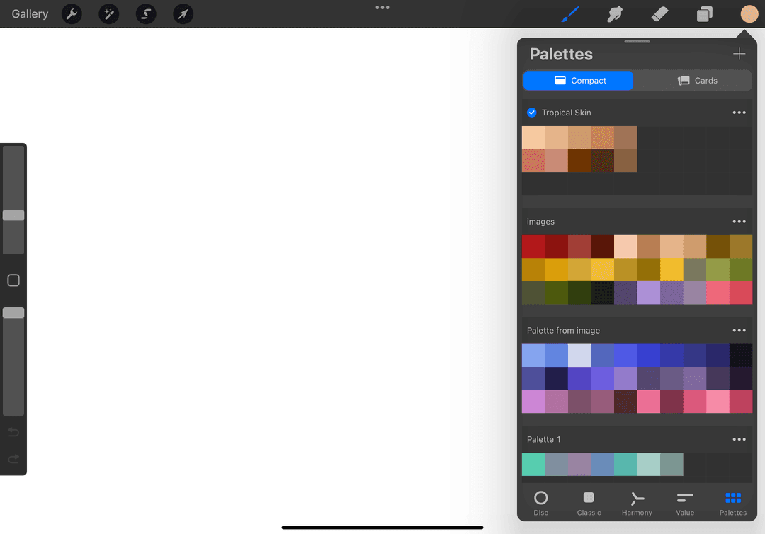
Just go ahead and download this free palette and play around! Importing palettes is easy-peasy, just check out our previous blog on How to Import Swatches to Procreate.
So there we have it! With Procreate color palettes made easy, unleashing your artistic skills and talents has never been more effortless! 🎨 Say ciao to jumbled and clashing colors and hello to a world of creative and colorful possibilities. Happy creating!
Try two real lessons from Masterclass for Procreate, free
Not a trailer. Actual lessons from the course. After you confirm your email, they open in Freya Studio and stay yours.
Halftone Tulip
The complete lesson, not a preview
Porcelain Plate Oil Painting
The complete lesson, not a preview
- Yours after email confirmation
- No card, no trial
- Opens in Freya Studio